How should Skype look like!

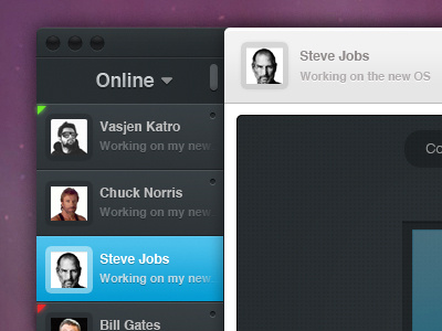
This is a work i have been practicing lately... i think Skype should do smth for their interface... there are so many applications now which have been design with great UX in mind, Twitter, Sparrow, Tweetie and many others.. Got inspired from some of those and thought to redesign some pieces of the Skype UI


