Find designers
Designer search
Quickly find your next designer
Post a job
The #1 job board for design talent
Inspiration
Courses
UX Diploma
Learn UX design from scratch in 6 months
UI Certificate
12-week UI skill building for designers
Live interactive workshops
with design professionals
Jobs
Go Pro
Log in
Dribbble: the community for graphic design
Log in
Sign up
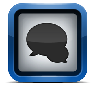
Messages
Philippe Lefebvre
Follow
Following
Like
#F4F5F6
#334559
#181F26
#9CA1A5
#2060A5
#B4BFCA
#608CBB
#5A7B9E
Download color palette
Here's a quick icon i've been working on my spare time for Messages
Posted on Apr 3, 2011
671
0
16
7
View feedback
Philippe Lefebvre
More by Philippe Lefebvre
View profile
Previous
Next
Loading…