Product label for the European Schnapps producer called "FANTOM

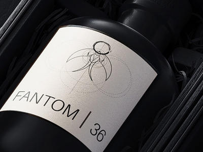
My main task was to make it not only in the aesthetics of the Japanese teachings of Wabi Sabi, but also at the same time more European than Asian. So I decided to choose the O-shaped calligraphic element that you proposed, but complete it with well-readable element of European heraldy - Image of the swallow. I made swallow in different variations, using classic Golden Ratio method. All of them have not only well distinguishable features of the bird, but also, for example, sharp cutouts on the wings, as well as sharp ends of the tail. These elements, typical for bats or other creatures of the night, should emphasize the "FANTOM 36" brand name, making the logo more mysterious and gothic. I also tried to make the logo as clean, readable and minimalistic as possible. The image embedded in the golden section elements can also be used to design your products (as shown in the picture with a light label). This composition resembles images from manuscripts of alchemists or inventors of the Renaissance, which also corresponds to the brand identity.


