Tehnical Crunch Logo

Tehnical Crunch is an imaginary client of mine. Company that makes & distybutes healthy pastries and which products are available in their stores worldwide.
They asked for logo which will convey a sense of fame, while at the same time being fresh. They prefered an abstract logo that uses the color black. The logo will be embroiderd on uniforms.
Solution:
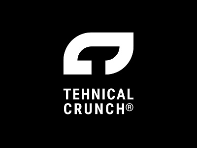
The logo hides initials of the company in itself - letters T and C are combined in the way that negative space in the letter C hides or better said reviels the letter T. I turned the letter C beacouse I wanted the letter T to be noticed first, and only after C.
The colors black and white make logo elegant.


