Microsoft Teams & Fluent Design System on Big Sur

See the before and after.
The truth is things could look good. And they could look good with the very design systems that are currently being used to make them look absolutely terrible.
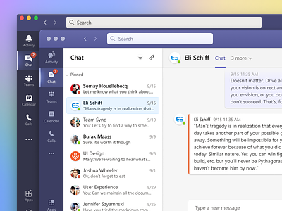
Let's consider Microsoft Teams, as I've adapted it to macOS Big Sur. Not the greatest app ever made, but it could make up for that if it used Microsoft Fluent in a thoughtful way.
Let's start with the header bar on top. It uses the system inner highlight, which looks like absolute mud here. A half-pixel of white and a half-pixel of grey. They're not even trying to incorporate it into the purple header. And let's consider that purple header, it supposedly has a light source, given it has a highlight. But the purple is dull and flat, despite this.
How can this be fixed? Maybe we might add a subtle gradient and shading on the top and bottom which incorporate the color chosen for the bar itself. And how about making the traffic lights part of that structure while we're at it.
How about the sidebar? Microsoft somehow permitted their designers to add a glow (a glow which doesn't show up much elsewhere in the flat app mind you). But let's go with it. If we're going to add a glow, at least use the opportunity to make it look nice and have a light source of its own.
The crazy thing about my redesign of Microsoft Teams is that nearly every shadow, color, type size, and icon is sourced straight from their design system, Fluent Design. The exceptions to that direct-sourcing are my glow, several gradients, and several purple color choices, as well as a few border-radius modifications. I also fixed some grid alignment issues, though honestly it was pretty good in that respect. Everything else exists in Fluent Design, albeit with different treatments chosen by me than they baked into the designs. (I naturally redrew most of the elements by hand).
Microsoft designers didn't make the foreground design I've drawn—not because they're constrained by their Fluent Design, but because they're constrained by the human will to make enjoyable things being so throughly destroyed over the past eight years of our industry's life. This is something that designers at all levels of industry willingly and eagerly invited, and that is why all software is ugly—and by extension, it is why software has become awful to use in nearly every respect.
And let's be real. No apps will look a thing like this in macOS Big Sur. Because if any organization despises design more than Microsoft, it's Apple.


