Ice Queen's branding | French and elegant sorbet.

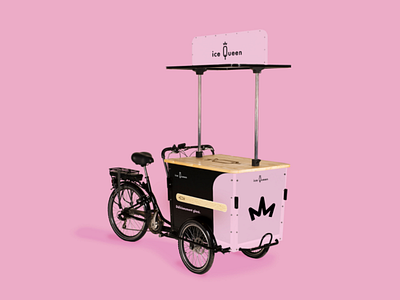
The visual identity is everything that revolves around the brand to bring it to life. It can be an advertising car, objects with its effigy or even an advertisement. So I took up the idea of the wooden stick which immediately refers to a sorbet or an ice cream. I removed the fruits that were inlayed in order to make a generalization so that future customers can recognize the product in question. I have also kept this roundness with a pastel pink shape on a black background that fits on all supports and will allow to visualize the brand behind this graphic composition. The slogan "Deliciously icy" is mostly written under the stick to keep a balance and an understanding of the visual. The whole thing is quite sober and not too much provided in order to show the elegance and the prestige of Ice Queen. For the vehicles, I respected this with a horizontal stick and for the vending machine and beach flags, it's vertical. In each case, the driving line and the brand identity are shown. Its values are also conveyed through its compositions. The logo is often at the top so as not to alter the graphics. As a small aside for the distributor, I decided to put a raised crown to be able to distinguish him among a crowd and also to remind Ice Queen.


