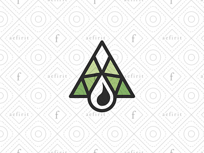
Oil Industry Logo
Structure, mountain and oil, three elements united in one concept. Simplified design, well-contrasted and defined shapes to optimize small-scale readability and memorability. The triangles are based on the metal structure of the oil towers and these in turn form a mountain. The drop symbol is larger than the triangles, making it the main element of the logo by visual weight. A green symbol for eco-friendly industries.
Thank you for watching! :)
You can see all my logos for sale here:
See Catalog
aaa
branding
drop
eco
ecological
ecology
for sale
geometry
industry
line
logo
mountain
natural resources
nature
oil
petroleum
simple
structure
summit
View all tags
Posted on
Aug 15, 2020
More by aefirit View profile
Like


