Payment Sent Screen

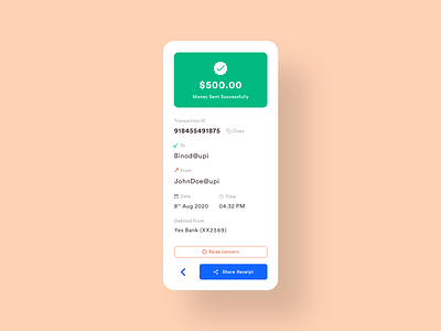
The anatomy of this design consists of 5 major elements i.e :
1. Success Message
2. Transaction ID & Copy button
3. Sent from whom to who details
4. Date & Time with Icons
5. Primary, Secondary & Tertiary Buttons
---------------------------------------------------
1. Success Message
Here, The user gets to know that the task has been done successfully by:
• Seeing the colour GREEN
• The tick mark icon
• The message of succession
---------------------------------------------------
2. Transaction Section
The user gets can see the
transaction ID and the copy
button easily
• Here, I added the copy button because If the user just wants to send the ID for verification or whatsoever the user can simply copy the ID without having to write it down thus saving time
and offering maximum efficiency.
---------------------------------------------------
3. Sent from whom to who details
The user can see to which address the payment has been sent & by which address the transaction has been made.
• Tip: Color your icons if the icons are too similar or if you think they might confuse the user
---------------------------------------------------
4. Date & Time
• Tip: General good practice is to place the date & time aligned together because users mostly tend to read date and time together
---------------------------------------------------
5. Primary, Secondary & Tertiary Buttons
These buttons should be placed at the bottom as it is easy for the thumb to navigate without stretching much.
• Tip: In buttons always try to use Icons with labels, as it signifies more about what that button is supposed to do.
_____________________________________________________
Hit Like if you liked the shot!
Let me know your thoughts on this explanation in the comments below. :)


