Mmicons

13 Responses

  1. Pro Fares Farhan Fares Farhan

    Really need comments, opinions, critiques, anything.. :)
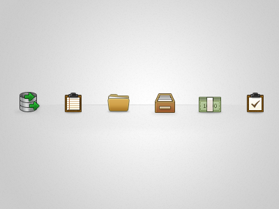
    about 2 years ago

  2. Pro Bady Bady

    lovely! :D, I think the database icon need more tweak on its drop shadow, the rest is maybe the use of color. Would be really nice if the color a bit eye catching :P, just my opinion

    likes

    about 2 years ago

  3. Pro Fares Farhan Fares Farhan

    @Bady Noted. Colors and shadow. Thanks buddy :)

    likes

    about 2 years ago

  4. Pro Ricardo Salazar Ricardo Salazar

    Like them! Maybe the folder icon needs more tweaking, since it looks a bit blurry compared with the others.

    likes

    about 2 years ago

  5. Pro Fares Farhan Fares Farhan

    @Ricardo Thanks. I'll find out how to fix it, I think it's the slightly skewed curve.

    about 2 years ago

  6. Natalie Nash Natalie Nash

    First of all, excellent start and great concepts.

    If these are part of a set, they should technically follow the same perspective. 50% are front facing, and 50% are at a slanting forwards angle. I would suggest picking one direction, and changing the remaining to follow suit.

    I like the strokes you've used, it makes them crisp, but the folder is lacking from the same outline. I would try where possible, to use the same styling (highlights/shadow/strokes) on a set of icons, to keep them as uniform as possible.

    I love the muted colours you've used, but the icons could benefit from more highlighting and perhaps a touch more contrast/saturation.

    I can't really make out the shadows due to the gradient of the background, could you possibly preview them on a white background?

    Again, great work and bloody great for a first attempt (?!).

    NB: Fares did invite me to critique, I'm not being a bitch :p

    likes

    about 2 years ago

  7. Pro Fares Farhan Fares Farhan

    @Natalie Thank you so much for the detailed review. And yes, this is my first attempt in icon making, one of the obvious proofs is your feedback. So many silly mistakes in my icons :D

    likes

    about 2 years ago

  8. Natalie Nash Natalie Nash

    You're most welcome, and they aren't mistakes at all, they are opportunities to learn and expand one's skill set.

    You have a great talent to build on, so you're well on your way :)

    about 2 years ago

  9. Pro Fares Farhan Fares Farhan

    @Natalie Humbled. Thank you for the encouragement. Very much appreciated. *bow*

    about 2 years ago

  10. Armono Wibowo Armono Wibowo

    I second Natalie about highlighting and color contrast. But since this is your first attempt at icon creation, I'd say congrats on making it this good! You're definitely in the right direction. Kudos!

    likes

    about 2 years ago

  11. Pro Fares Farhan Fares Farhan

    @Armono Thanks mate :)

    about 2 years ago

  12. Juan Gomez Juan Gomez

    i gotta go against the others on the use of colour, i like the actual pallete it makes them more unique than the rest of the colorful icons arround, i also think that as @Natalie said go with one perspective and the frontal would be easier/readable since they're small. Another tought is about the database icon since its colour is lighter the darker stroke makes it look different than the rest, why no trying toning down the dark strokes since the colors are actually not that bright, of course the background has lots to do with the actual icon creation but a good icon should work on every background (if possible), i've found that using a semi-transparent dark stroke helps mixing the icons to the background. I hope this helps, and thanks @Natalie for inspiring me to create a toughtfull comment lol.

    likes

    about 2 years ago

  13. Pro Fares Farhan Fares Farhan

    @Juan Thank you so much, also for the semi-transparent-dark-stroke tip. :)

    likes

    about 2 years ago

keyboard shortcuts: previous shot next shot L or F like