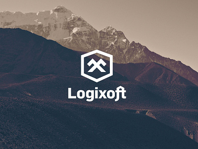
Logixoft Logo Design Update A

New font called RennerBoldArchiType, but with slightly customised 'f & t'.
The letter 'x' now exactly matches the 'x' mark (other than the arms), whereas before the x's were quite different.
Removed the faux angled ligature as just didn't look good. I think overall this font is a far better companion to the logomark.
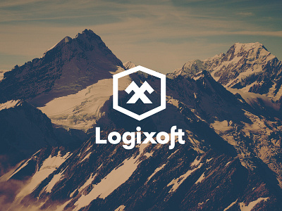
Should add: photograph is from Picjumbo.com 'Mount Cook National Park BY ZIVOTNACESTACH.CZ"
Lengthy Version
The 'X' logomark sort of came about through some abstract sketching, trying to find some 'hook' within the brand name that could be used with a logomark. Often one looks at the initial when forming a logomark around the name, but after looking at various 'L' options it was apparent it would not really work.
X
I ended up looking at the 'x' as the 'hook' to base a logomark from, but given x's in general are somewhat common, it needed to hold it's own and actually create a statement in itself, rather than just an initial/letter for the sake of it.
You can see from the uploaded diagram how both x's share the same form
With the main keywords from your brief churning around, I saw a way to almost personalise Logixoft, or at least create a form of symbol that could be linked to a personality rather than a random/abstract object thus giving your brand a more personable feel. Immediately, the angular formation of the 'x' with short-arms, makes the brand less clinical and thus more memorable, and especially as Logixoft is just you.
The angular and steep nature of the 'little x-man' also then comes across as being strong, powerful, bold, decisive, reassuring, confident signifying 'you' have your clients' back and good intentions when they need it most.
Mountains
From playing with this shape, and trying to find some imagery to mock-up some layouts, I came across some stunning photographs of mountains, and the similar angular nature seemed another perfect fit, and instead of just using it to provide context, I realised we could utilise this sort of imagery as supporting brand identity styles. So you can see from the letterhead and cards how this could work. The top half of the logo's container is almost the same angle as the mountain behind it, more of a coincidence, but when I placed the logo over the photograph it immediately hit me, so that's one more visual link that is shared.
Personally, and professionally, this has turned out as a far far more meaningful, and logical identity design, than I had anticipated.
For a company that is 'security' themed, we have managed to completely avoid clinical, cliche, cheesy imagery/meanings in the logo and identity, and instead created something with strong and clean logical and applicable implied visual meanings and associations, but the winning element is that it's also a personable brand but without being too personable, if that makes sense. It's not really a 'mascot', but could be, at a stretch, viewed as such.
Also this 'X' will work brilliantly at small sizes: favicon, social media profile images etc. Maybe some without the container/shield, some with.
Fonts
The wording is based on a font called Renner, but I have customised the 'L', 'x' a little and also the 'f & t' to form a faux ligature, and overall works really well with the logomark.