Slide Redesign


With our most recent release, we shipped an update to our learning slides. This update addresses a lot of long-standing UX and UI issues. Most notably:
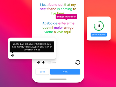
* The quiz timer was confusing to some learners. So instead of adding time to the countdown, now you simply pause or resume the countdown.
* The font sizes were too small. Now the fonts are larger across the board.
* The control area was outside of the comfort zone you can reach when using a device one-handed. Now we have a standard control area that is easier to reach with your thumb and is in a persistent location.
Please let us know what you think!
Smash that “L” and follow us here on Dribbble.


