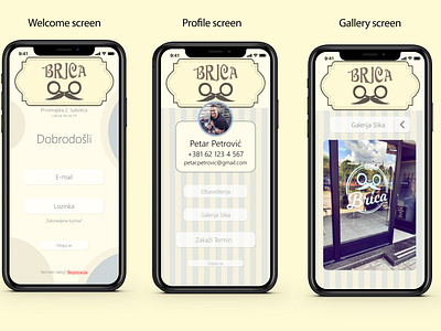
UI/UX Design for a barber appointment
Hello Everyone!
I would like to introduce you to my second project "Barber appointment app", which helped me learn many new things and improve my UI/UX design skills.
I came up with the idea for this project because the current system of scheduling haircuts at my barber is outdated, it's not eye-appealing, it's slow and buggy.
My thinking process was to make the design beautiful, in line with the style of the hair salon, to be retro-modern, simple, and functional. Without too many options, unnecessary links, animations, sliders, etc.
The final design is just that, a simple and functional application, which can be used by both younger and older population.
Throughout this project, I’ve learned that everything should not be overcrowded with unnecessary animations, colors, fonts, etc and I followed the logic of "less is more". I've learned that it is not the same when you look at the project on a PC, on a 27 "monitor, and when you're looking at it on your phone, you need to consider which fonts to use and thus correct the design.
The owner of the hair salon is delighted, he likes the idea, design, and functionality, so the project was successful.
If you have any constructive feedback, please feel free to share it with me.
Cheers!
Here is the link to a video, so you can see the design in action :)


