Cow rebranded Rd.2

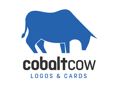
I took a new approach. This bull is more stylized and memorable I think. The stance is ready to charge. It;s the anticipation of something big about to happen which is much more aggressive than my previous brand(s).
I like the modern feel of the font (I modified a few letters)
Since the name is so ambiguous I think the tagline helps, but in some places if it's not needed for context then I can remove it - like on the website.
Again - your thoughts are appreciated.