Find designers
Designer search
Quickly find your next designer
Post a job
The #1 job board for design talent
Inspiration
Courses
UX Diploma
Learn UX design from scratch in 6 months
UI Certificate
12-week UI skill building for designers
Live interactive workshops
with design professionals
Jobs
Go Pro
Log in
Dribbble: the community for graphic design
Advance your career with a Professional Diploma in UX Design
Learn more
Log in
Sign up
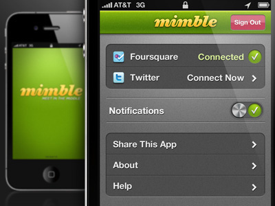
Mimble Settings
Dan Sullivan
Follow
Following
Like
#595A59
#141413
#A6A7A6
#689310
#A7BE3E
#496A0C
#B66C82
Download color palette
Settings screen for Mimble. Feedback is welcome!
Rebound of
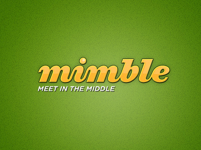
Mimble Logo
By
Dan Sullivan
app
ios
iphone
list
mimble
notifications
settings
slider
toggle
ziggurat
View all tags
Posted on Mar 29, 2011
3,059
2
53
8
View feedback
Dan Sullivan
More by Dan Sullivan
View profile
Previous
Next
Loading…