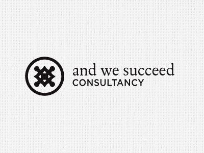
And We Succeed Logo [B]
Refer to first Dribbble for brief explanation on what the logomark means.
After the awesome feedback on the first 'Dribbble', I spent the afternoon and evening looking at these comments and made some noticeable changes.
Replacement font (FoundeyKeylineExpert) in bold all-caps, helps define the brand name much more than previous all lower-case example. Feels neater and more compact. The reason for the lower case was trying to reduce overall formality, but it didn't work. As suggested in comments, open kerning for 'consulting and have bumped up the weight of this also.
Reduce keyline thickness of circle and have redrawn the logomark. Made the male connectors on the jigsaw more oval, less round, tidied up the shape in general as well as improving the inner white details.
The logo works really well when text is centered and mark placed centrally on top, but I can't help but think this looks a little 'too' stuffy. This ranged left alignment feels a little 'younger' and more appropriate for a solo consultant. The centered block option I think would suit a company more.
Sadly, at least in the opinion of this designer, she wants the logo coloured Purple and Gold, probably my two worse colours. Have tried to 'suggest' alternatives, but there is no room for negotiation on this. So now looking at colour splits with gold, purple and black.
But feeling a lot happier with the direction now, thanks to all the previous comments. :)

![And We Succeed Logo [B]](https://cdn.dribbble.com/users/1120/screenshots/13877/media/e760a47e48b3020da4d3e7a497b48e84.jpg?resize=400x300&vertical=center)


