Harvest iOS -Timesheets

Time is of the essence! Over the past couple of months, I've started taking a deeper dive into Harvest's iOS app just to see how different the experience was from their web app.
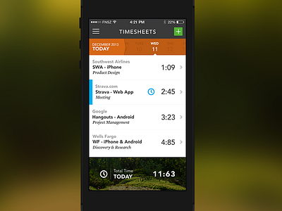
If you've used the Harvest iOS app, you already know that there's containers, in containers and gradients for days! I personally think that the design could use a little more white space. As a design exercise, I wanted to take the UI/UX for a little spin.
As always, I can haz feedback (constructive) on the UI/UX for this screen? Stay tuned for more!
P.S - Feel free to rebound, slam dunk, alley-oop this shot with any of your ideas, too!
Thanks!
Phi


