Logo Color Options
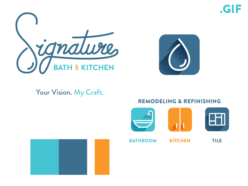
Need opinions. Which color option do you prefer. I am pitching the first option to the client (blues/orange) as part of his rebrand. He is keen towards the crimson/black look.
I do feel they are both strong color options, but professionally feel like the blues evoke more of the feeling you'd want in a bathroom/kitchen refinish or remodel. The first palette plays well with the logo mark as it is a blend of vintage and modern (refinishing and custom work). It also evokes a calm and sense of water with the blues and brings a modern twist with a pop of color. Thoughts?


