


Notefile for Mac icon, revised

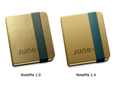
I think the difference in these icons is even greater than what you can see here. With the original icon I was too concerned about making it look realistic—and I spent too much time trying to compensate for a sloppy texture instead of just fixing the texture. It was also my first icon for a real Mac app (something that wasn't a Dashboard icon or a simple utility) so it was hard just getting to this point. On a white background like this I don't mind it too much, but I was never quite happy with it in use.
I've also put extra work into making sure the new icon will look great on a Retina display. One thing I never realized is how important it is to include all the @2x sizes in an icon. I always assumed that if I omitted, say, the 128@2x icon, it would just use the 256@1x icon. I'm pretty sure that was a false assumption: it seems to pick a larger @2x size and scale it down. As a result the texture was getting smoothed out and muddy—the whole thing looks much more crisp now.


