Analytics Hub

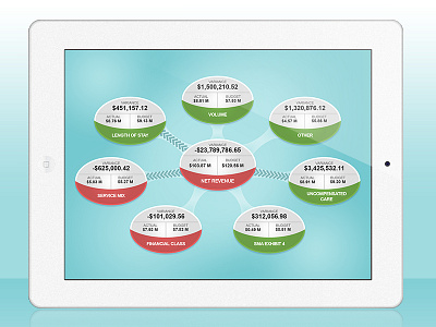
A fresh take on analytics and informational dashboard design. This hub is designed to show an at-a-glance analysis at the business components that contribute to the overall net revenue. The colors (red and green) quickly identify a negative or positive variance between budgeted and actual values. The arrows on the arms of the hub are animated to draw attention to areas where the variance (whether positive or negative) is undesirable.


