


AT&T Project

I helped out a friend whose in the core project program within the business school at my University. His specific project was about dealing with a new GPS system that AT&T was releasing and needed designs for the shipping route + an app that used the GPS system to track pets of prospective buyers. All right of the AT&T branding is owned by the corporation and I have no affiliation with AT&T plus the designs represent no cruet/prospective ambitions of the AT&T brand, it was purely made as a conceptual idea for a school project.
The whole project was designed to feel as if it would be an actual AT&T product/promotion. All official branding colors were used for both the app and the shipping map and was designed to be clear, concise, and uncluttered. The consistent color choices were also used to help tie the projects together and bring repetition (which can also be found in the map vector on the map page and the background of the app which was the map used to ad a subtle texture and visual interest of the app background) though our the designs which was added on the the main font couch of futura medium.
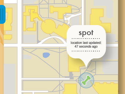
Also, a map of Central Michigan University's campus was designed and used to be as an added bonus factor to the project to help build relevance within the business programs project which would help sell the idea better based on the audience and grader.


