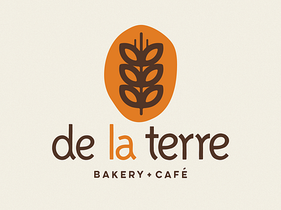
De La Terre Bakery Branding
De La Terre Bakery specializes in long fermented, hand-shaped sourdough bread, along with a selection of and hand made pastries. They take pride in locally sourced ingredients, some even being from their families farm.
My main inspiration for the brand came from the product they make. No two loaves of bread look the same, they have no straight lines, corners or sharp edges. Everything is naturally and organically shaped. In turn every letter you'll find here is a bit different from the last giving life to the letters and also that same hand made quality. There are no straight edges and all of the corners are rounded and smooth. The only element keeping true geometric form is the wheat, symbolizing the foundational element of de la terre's product — the ingredients.


