B ♡ // Translation


A translator specialized in technology and design asked me to create a logo for him
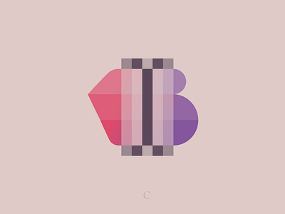
The key idea was to render a shape undergoing transformation and the first letter of his name. But in the process, we started seeing some more elements: a text cursor (it's known as I-beam pointer) and a heart
I suppose it's easy to understand with a little context. But we need some fresh eyes. What do you see? What do you like or dislike?
As always, I highly appreciate your feedback and suggestions :)


