Find designers
Designer search
Quickly find your next designer
Post a job
The #1 job board for design talent
Inspiration
Courses
UX Diploma
Learn UX design from scratch in 6 months
UI Certificate
12-week UI skill building for designers
Live interactive workshops
with design professionals
Jobs
Go Pro
Log in
Dribbble: the community for graphic design
Advance your career with a Professional Diploma in UX Design
Learn more
Log in
Sign up
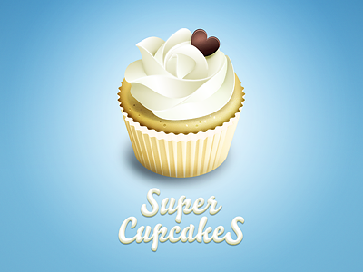
Super Cupcakes
Julian Burford
Available for work
Follow
Following
Like
Get in touch
#9DCFEA
#6FB2D7
#85BEDD
#E2EFED
#DAD3A4
#C8AE5B
#72553A
Download color palette
Sweet Super Cupcakes!
bakery
chocolate
cream
cupcake
heart
icon
logo
muffin
wipcream
View all tags
Posted on Mar 14, 2011
12,302
6
251
19
View feedback
Julian Burford
Branding with Illustration
Get in touch
More by Julian Burford
View profile
Previous
Next
Loading…
Loading…
Loading…