Building/Construction Logo

Revised 1st concept for an American company that specialise in the evolution and formation of building panels for 2-7 story buildings. Example of use
Still working on choosing the ideal font and also playing with colour, also details like edges and alignment are not firmed up as yet.
The client wanted something that showed an element of the science/design and thought that goes into making each panel but also showing/hinting at the finished product. One challenge was that they wanted a 'P' to form the logomark, this is what really has taken time to work on. A few other suggestions included an interest in factoring in some kind of exploded diagram view…
Given that 'P' is lopsided and top heavy, it is not the best candiate for basing a visual representation of a building on. Safe to say this has been a headache inducing project but also a very challenging and fun one. Fortunately the client has been absolutely brilliant and has left me totally to it, no rush with deadlines and no frequent checking in's.
The countless doodles of flat ideas, isometric ideas, exploded view ideas and numerous random ideas eventually lead to this design.
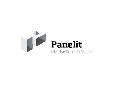
We basically have two structures that form the P, utilising the positive white space. The trick here was to make the two boxes look different heights but that also looked the same height, important in making the positive space/the roof look like a P.
We end up with an optical illusion of sorts, only really possible by ensuring the roof is seamlessly joined between the two boxes.
There is a small bonus in that the hole of the P provides a double meaning. On one hand it could be a raised angular doom on the roof or it could be a form of skylight, showing the interior walls.
I have purposefully left the exterior walls free of details, like doors or windows. The reason being they provide context, details to gauge height or size. In this case I didn't want to hint at any specific size of building, so the buildings coud easily be 2 story or even 7-storey.
Font choice is limited to a style of slab-serif which I feel is a perfect candidate for a identity of this kind. The only problem with a slab-serif is that they are mostly quite chunky or bold. Trying to find one that is refined, subtle in it's design has been a little tricky. Still not 100% convinced with this choice, still feels a little too chunky for me. So still on the look out for more refined versions of slab-serifs.
As a final note, the baseline of each line of text falls on 2 equally spaced lines as can be seen in this mock-up.


