Screen Shot 2013 11 03 At 7.30.32 Pm
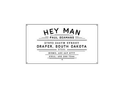

Designed for a rural hay farmer who goes by "Hey Man," this card had me stumped for quite a while. Looking into old farm and western signage, I decided to take that approach for typography. Also, I think the typeface on lost type co "haymaker" was made for this situation! For now: wondering if all the extra lines are too much? Should it be simplified?


