Linkedin UI Redesign

I have always loved how Linkedin has sorted their User experience design, but when it comes to User interface I believe its time that they should ponder upon it.
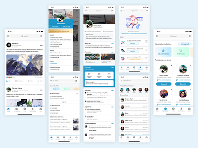
This is my take on redesigning the UI by bringing in more space elements, illustration and colours and maintaining the professional look of the application.
Feel free to hit the like button and constructive criticism is always welcomed.
Stay home and create amazing designs, cheers!


