Green Ink Studio New Logo
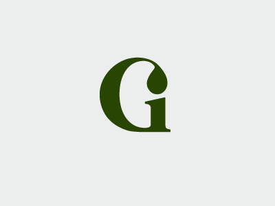
So... I too am updating my logo. Thought I shoot this as my first post. I wanted a custom monogram and got this letter shape in my head. I drew the shape on quadrille-ruled paper first to get the form down. I want the "drop" shape to clearly be the dot of the "i" while still maintaining the ball terminal form of G. Still working on the type part (always the hardest for me).


