Skitch Rebrand


I was fortunate enough to be part of the incredible team of designers at Evernote to rebrand the Skitch product. We wanted to post that work here and also share some of it’s story.
Skitch Co-Founder Keith Lang: "We had tried a number of times to re-think the Skitch brand. The heart was something dear to all of us, especially Cris Pearson and I. Many people had expressed their love for the logo, and we wanted to create something that was more honest to the application, more modern, and also a great logo."
We started by exploring many new approaches to the heart symbol, concluding the heart would always have some baggage as a symbol. So we moved on, exploring many different directions, until finally thoughts turned to the arrow – our most used markup tool.
We quickly dismissed many archery-related metaphors:
• Arrows are what Skitch makes
• Bows are the method of sharing what you’ve made
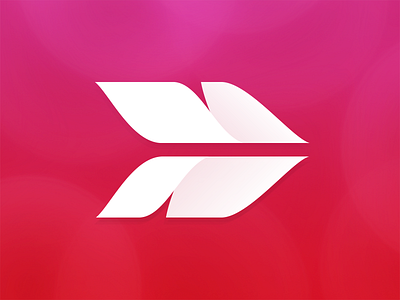
Then we began to consider the feathers on an arrow. The fletching. This is what guides the arrow. It is the reason it's able to get to it's point. And the idea grew from there.


