Find designers
Designer search
Quickly find your next designer
Post a job
The #1 job board for design talent
Inspiration
Courses
UX Diploma
Learn UX design from scratch in 6 months
UI Certificate
12-week UI skill building for designers
Live interactive workshops
with design professionals
Jobs
Go Pro
Log in
Dribbble: the community for graphic design
Log in
Sign up
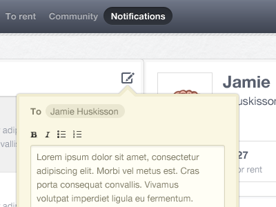
Bold, Italic alternative
Jonno Riekwel
Available for work
Follow
Following
Like
Get in touch
#F9F8F0
#CDC9B8
#535968
#6C7384
#A4A49D
#857C67
Download color palette
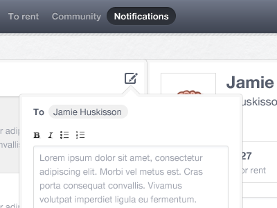
Which one do you like better? I prefer this for better contrast.
Rebound of
Bold, Italic
By
Jonno Riekwel
clean
minimal
webapp
white
View all tags
Posted on Mar 7, 2011
4,054
2
132
17
View feedback
Jonno Riekwel
Founder, iA/UI/UX Designer and Front-end Developer.
Get in touch
More by Jonno Riekwel
View profile
Previous
Next
Loading…
Loading…
Loading…