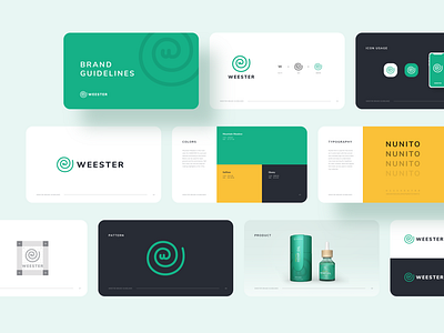
WEESTER Brand Guidelines


Hi Dribbblers,
I just finished another project of identity, this time a company which was born to deliver Hemp (not cannabis), so without the psychotropic effect, to the people who need, for pains, amnesia, insomnia, etc.
I fused the spiral shape with the letter 'W' for this logo, the idea is showing the pain side of the patient that we are here to help you with our products in these situations.
I hope you guys like it.
Let me know your thoughts in the comment section.
--
Let's work together!
Contact me at mailtojaffari@gmail.com


