Boneslarger

HDRV Companions

Shot_1299264411

12 Responses

  1. Pro Boneslarger Rick Patrick

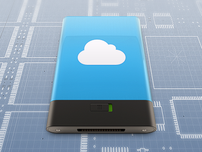
    Companion icons for HDRV icons, still in progress.

    about 1 year ago

  2. Pro Styled David Keegan

    This looks awesome! I'm not sure what it's for so this might not apply but it looks a bit long. Maybe it's just the perspective.

    likes

    about 1 year ago

  3. Foto op 23-02-12 om 19 Elias Keppens

    The perspective at the front is a little weird but I like the rest a lot :)

    likes

    about 1 year ago

  4. Pro Blueelf Benjamin George

    Beautiful work Rickinatah!! The gloss is teh sex!
    Note: I did find the perspective on the switch different from the rest of the body, if you haven't already noticed ;)
    Looking forward to seeing more!

    about 1 year ago

  5. Pro Avatar-2012-carré Michaël Betsch

    Perspective is wrong, but the reflections and colors are nice !

    about 1 year ago

  6. Pro Boneslarger Rick Patrick

    I think you guys might be a bit used to people using whacky perspective on the front of hard-drives. :)

    http://cl.ly/3D1n321c2k3l1m0i0D0B

    likes

    about 1 year ago

  7. Pro Hezral_formal Adi Hezral

    damn that looks good. i think they meant the perspective of what osx icons usually are in.
    i'm interested to look at the smaller versions. 48px?

    about 1 year ago

  8. Edwin shaved Edwin Brett

    can't wait to have the whole set!

    about 1 year ago

  9. Pro Styled David Keegan

    @Rick Because this is done in 3d the perspective is mathematically correct, my criticism of the perspective is that it looks visually off. I think the focal length is too extreme, which is causing the top to look stretched out. I think there is too much negative space around the cloud.

    about 1 year ago

  10. Pro Avatar-2012-carré Michaël Betsch

    @Rick : Okay, I get it now. The shape looks more like an former-generation Apple remote than an actual hard drive. That's what threw me off.

    about 1 year ago

  11. Pro Boneslarger Rick Patrick

    @Michaël: The length definitely looks exaggerated and I don’t like that. Which is kind of strange since it’s the same dimensions as the other drives, yet those look fitting.

    @David: I think I’ll have to play around with the camera. The icon as a whole feels thinner than the HDRV ones, despite behind the exact same height. I’d be worried about them not matching up then though, or having to bang my head on the table to get the camera angle right (again). As for the negative space, I’m not a big fan of huge glyphs on hard-drive icons, so this might be personal preference type of thing.

    As said, definitely work in progress!

    about 1 year ago

  12. Pro Styled David Keegan

    @Rick can't wait to see more, this icon series is awesome!

    about 1 year ago

keyboard shortcuts: previous shot next shot L or F like