Landing page - E-commerce

The hero section of a landing page is a powerful area. It is the first section a user sees after landing up on your page and ultimately the decision maker. Whether the user continues to stay on your page and convert depends on how persuasive your hero section is.
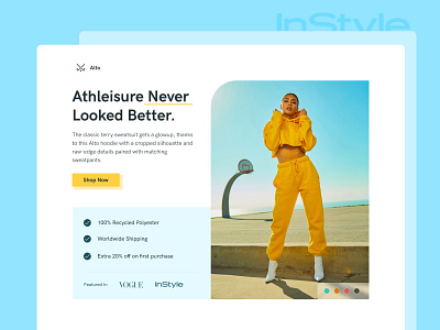
This is a landing page for an e-commerce fashion brand.
Here’s the design break down :
Messaging - The messaging should be bold and easy to read. Use appropriate fonts and make sure to give the content a good amount of breathing space and importance.
CTA - A bright & bold CTA. Make sure that the CTA stands out against the background.This makes it more eye-catching and clickable.
Value - Why should users convert ? In this case go ahead and make a purchase ?
Adding elements such as material assurance, ease of availability and offers increases the value of your product.
Hero Image - Well a picture is worth a thousand words so make yours count.
The graphic should add value to your claims.
Trust - Why should users specifically trust your product ? Adding the testimonials or platforms where your product has been noticed - Vogue, Instyle in this case allows users to trust your product, if Vogue thinks it’s credible then it must be.


