Find designers
Designer search
Quickly find your next designer
Post a job
The #1 job board for design talent
Inspiration
Courses
UX Diploma
Learn UX design from scratch in 6 months
UI Certificate
12-week UI skill building for designers
Live interactive workshops
with design professionals
Jobs
Go Pro
Log in
Dribbble: the community for graphic design
Log in
Sign up
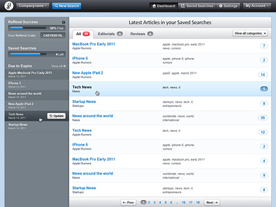
Backend Interface
Claudiu Cioba
Follow
Following
Like
#F2F6F9
#77818A
#9DA8B2
#5B6268
#282A2E
#5AA2DA
#687A8A
#E24756
Download color palette
analytics
dashboard
interface
reports
ui
user interface
ux
web app
web application
web design
View all tags
Posted on Mar 3, 2011
25,260
82
403
6
View feedback
Claudiu Cioba
More by Claudiu Cioba
View profile
Previous
Next
Loading…