


Yosemite National Park

Redesigning the logo for Yosemite National Park was both a fantastic opportunity and a huge challenge I was eager to take on. The redesign needed to be seen as a visual evolution of the park logo that was both true to the heritage of the park and continue to inspire the next generation of park visitors.
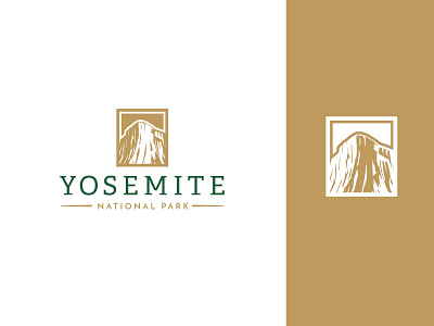
Through the exploration process, we designed rounds of icons and explored many typefaces that highlighted the natural aspects of the park. We also wanted to highlight a natural formation other than Half Dome, to spark the conversation that Yosemite is more than just one iconic geologic formation. Through this process, we focused on highlight El Capitan.
We paired the icon with a contemporary slab serif typeface that communicated a balanced and crafted feel. We looked to historical park logos to for the color direction – with subtle adjustments. We also created a sister logo for the hospitality management group that manages park properties utilizing the same typography and visual elements to keep all park brand assets in the same design system.


