'e' Logo Design By Graham Logo Smith

Keyline version: http://cl.ly/R9a0
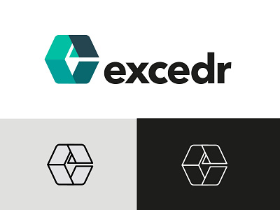
New logomark 'idea' for a company that: "… provides scientists with cutting-edge machine rentals and comprehensive coverage plans at an affordable price. Our goal is simple: to save laboratories time and money. We replace the high cost and inconvenience of buying and maintaining lab equipment with a smarter, more efficient means of conducting research.
Requirement was for a bold mark, ideally based on it's initial 'e', designed so that it would work in full colour as well as looking as strong, if not more so, in single colour keyline for engraving, product placement etc.
Nothing stuffy or geeky or too corporate, but neither too flash, cool or zazzy…
Due to how the 'exc' sound very strong, I decided to 'try' and design in some 'x & c' shape elements to the 'e'. Hence if you shuffle over the right side past the left, you'll get an 'x', and if you remove the little 'pyramid' in the middle, you get the 'c'.
So, in effect, the goal was to create a somewhat ambiguous letter formed of 3 letters, and that it;'s the overall shape that will come to represent the company, rather than a singular initial 'e'.
Font is Avenir Next Bold.


