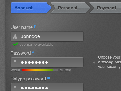
Very nice. I like the feel of of things. However the input fields, User name, Password, Retype password look to button like. A more inset look would read better.
I know it's a little unnatural that they're not inset, but I kinda like the look of it this way! Feels different but still pretty clear what to do with the field!
Probably worth asking if this is a web interface or a tablet/touch interface. Because the button-like field might actually be more ideal if it's touch (and of course some websites are viewed on a tablet these days anyway)
It'd be good to see what one of the fields look like when it's selected (in focus). Perhaps to Ricardo's point about congestion, when one of the fields is selected, the other ones could dim slightly?
With all due respect, I like the overall feel of this design just the input fields need to represent their interaction...to input. Here's a little rebound fun.
@Alex Tenyotkin it wasn't built with a single purpose in mind, but I really like your approach regarding the tablet UI and the idea that the other elements are shading out when the field is in focus.
8 Responses
Pro
Tommy King
This is my most recent work. First shot so be generous with comments and likes :)
Thumbs up for drafting goes to Jakab Zsolt
about 2 years ago
Very nice. I like the feel of of things. However the input fields, User name, Password, Retype password look to button like. A more inset look would read better.
about 2 years ago
Pro
Lennart Breel
I know it's a little unnatural that they're not inset, but I kinda like the look of it this way! Feels different but still pretty clear what to do with the field!
about 2 years ago
Pro
Tommy King
Thank you @Lennart this was partly the idea behind this concept, try something different from inset style, I know that feels more natural today :)
about 2 years ago
Pro
Ricardo Salazar
I like the style.
However it looks congested to me, so maybe try to simplify it a bit. Other than that, very nice!
about 2 years ago
Pro
Alex Tenyotkin
Probably worth asking if this is a web interface or a tablet/touch interface. Because the button-like field might actually be more ideal if it's touch (and of course some websites are viewed on a tablet these days anyway)
It'd be good to see what one of the fields look like when it's selected (in focus). Perhaps to Ricardo's point about congestion, when one of the fields is selected, the other ones could dim slightly?
Anyway, good job. I definitely like it.
about 2 years ago
Rebound
Login form steps
by Tony Gil
With all due respect, I like the overall feel of this design just the input fields need to represent their interaction...to input. Here's a little rebound fun.
about 2 years ago
Pro
Tommy King
@Alex Tenyotkin it wasn't built with a single purpose in mind, but I really like your approach regarding the tablet UI and the idea that the other elements are shading out when the field is in focus.
about 2 years ago