Anti patterns

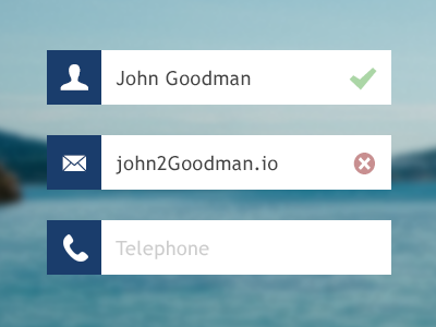

Today I started designing a new form for tradespeople to sign up to MyBuilder. I wanted a really slick, flat interface but the more work I put into the PSD, the more I realised I was making big usability compromises. I decided to take it further as an exercise and create a form of anti patterns.
- There is no way I could find icons for later inputs, for example VAT number.
- Having inline labels can cause people to forget what they are inputting.
- The line length is short and wouldn't allow for longer names or email addresses etc.
- Long inputs would likely run into the validation icons.
- If I needed to, it would be difficult to pull a input out of a design if I chose not to use a background image or colour. There is little to no versatility.


