HappiHub Component Library & Styleguide

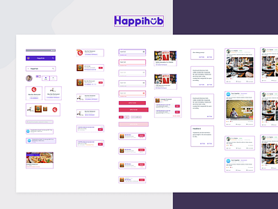


For a long time, I have been collaborating with HappiHub team. They are creating next-gen alternative marketing channels for grocery, restaurant, physical stores etc. with data and exclusive deals for customers. Here I presented some essential components from the library and part of the design style guide.
My role was to shape their Product by refining different user flows, creating a component library (almost created a design system) and polishing visuals. As the team is relatively small, it did not require to build a complete design system with lots of documentations and fancy add-ons. That would be counter-productive for the current rapid product iteration they are doing. However, the key features were:
- Consistent brand presence with minimal usage of colour variations
- Reusable and dynamic component library
- Smart and responsive components
- Clarity and context over everything else
Let me know if you have any feedback.


