Looking good Stephan. A critique would be the font size of the tweets (which are presumably the most important elements on the screen). The iPhone as you've rendered it here, is larger than my iPhone held up to the monitor, which means the final text will even smaller than it's shown here. I'd bump the size of that text up quite a few notches and bump the size of the username down by quite a few (how many times do you not know who a tweet is from after seeing their photo?)
Since there are probably thousands of Twitter apps out there, It might be an interesting challenge to reduce what we know even further design-wise. We all know how twitter looks and how we use twitter today, but if you came-up with a different way of reading tweets, then you wouldn't be designing "just another twitter app".
Since most people read way-more than we write (or so we hope), wouldn't it be cool to have a Tweet Reader with no navigational buttons? And you could control everything with one thumb?
The idea is quite simple: make twitter easier to read on the iphone without stretching to reach for back buttons, and focused-clicks.
I could scroll a list vertically, then when I arrive on a tweet, I might want to look at all of this guy's past/future tweets. Instead of clicking, I could drag left-to-right or right-to-left to view all of his tweets. (a similar interaction to "deleting" an email, but instead of being presented with a button, a new view loads on-screen) Upon entering his tweet history, each tweet is full-screen. I can scroll through his tweets horizontally with a swipe of the thumb. When I want to return to all my friends, I just flick vertically in either direction and I'm back on the main list in the position where I started.
9 Responses
Pro
Stephan Wetzl
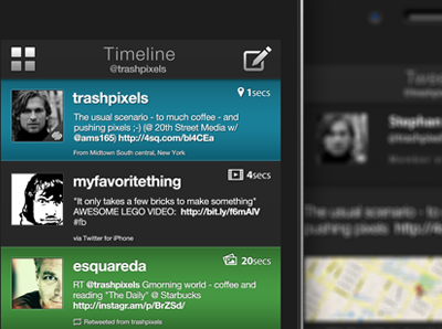
Working on a Twitter app UI for the iPhone and iPod touch...
over 1 year ago
Now, there's a motley crew.
over 1 year ago
Looks great Stephan ;)
over 1 year ago
Pro
Stephan Wetzl
@Taddeo thnx ;)
over 1 year ago
Pro
Alan Houser
Get out of my Twitter account. :) Love it!
over 1 year ago
Looking good Stephan. A critique would be the font size of the tweets (which are presumably the most important elements on the screen). The iPhone as you've rendered it here, is larger than my iPhone held up to the monitor, which means the final text will even smaller than it's shown here. I'd bump the size of that text up quite a few notches and bump the size of the username down by quite a few (how many times do you not know who a tweet is from after seeing their photo?)
over 1 year ago
Rebound
ThumbReader . Thumblr
by Alan Houser
(based on Stephan Wetzl's design)
http://dribbble.com/shots/118713-Twitter-App
Since there are probably thousands of Twitter apps out there, It might be an interesting challenge to reduce what we know even further design-wise. We all know how twitter looks and how we use twitter today, but if you came-up with a different way of reading tweets, then you wouldn't be designing "just another twitter app".
Since most people read way-more than we write (or so we hope), wouldn't it be cool to have a Tweet Reader with no navigational buttons? And you could control everything with one thumb?
The idea is quite simple: make twitter easier to read on the iphone without stretching to reach for back buttons, and focused-clicks.
I could scroll a list vertically, then when I arrive on a tweet, I might want to look at all of this guy's past/future tweets. Instead of clicking, I could drag left-to-right or right-to-left to view all of his tweets. (a similar interaction to "deleting" an email, but instead of being presented with a button, a new view loads on-screen) Upon entering his tweet history, each tweet is full-screen. I can scroll through his tweets horizontally with a swipe of the thumb. When I want to return to all my friends, I just flick vertically in either direction and I'm back on the main list in the position where I started.
over 1 year ago
Pro
Stephan Wetzl
@Alan Wow, great re-bound and a really
interesting concept ! :)
over 1 year ago
Pro
Stephan Wetzl
@Dustin Great point, i agree the font size of the username has to be smaller and the txt be bigger...
over 1 year ago