Olem

Download our menu

8 Responses

  1. Pro Olem Ole Martin Kristiansen

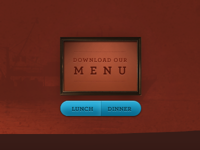
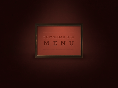
    Pumped up the contrast a bit on the 'Download our' bit.
    Also — the lunch/dinner links will fade in when you hover the frame :-)

    about 2 years ago

  2. Pro Me James ✌

    This is coming on, but i'd maybe try a different font for "Lunch" & "Dinner", Helvetica perhaps? The overstate edge looks a little jagged as well. Nonetheless, its coming together nicely!

    about 2 years ago

  3. Pro Liam Liam McKay

    Nice progression, this is really great work!

    about 2 years ago

  4. Pro Avatar Jonno Riekwel

    Looks lovely. Looks like the active lunch state is a bit pixelated on the left.

    about 2 years ago

  5. 180_180 Thomas Maier

    Looks very good! Only the left button seems a little jagged on the left..

    about 2 years ago

  6. Twitteravatar Tobias Ahlin

    Looking good! I'm thinking about the copy — does pushing the word "Lunch" vs "Dinner" really make any sense (compared to using verbs)? You'll surely understand, but I'm worried you may not interpret the frame as a header, and then you'd be clueless, at least for a couple of seconds :)

    about 2 years ago

  7. Pro Gedy Gedy Rivera

    Amazing attention to detail.

    about 2 years ago

  8. Pro Twitter_av1 Ilina Simeonova

    Cool colors!

    about 1 year ago

keyboard shortcuts: previous shot next shot L or F like