iOS 7 - Home Screen

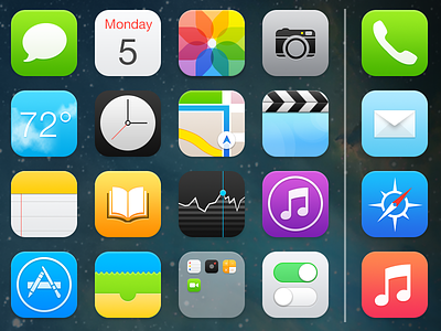
I took some time over the weekend to clean up iOS 7's home screen, designing it the way I originally imagined Apple would head when placing Ive in charge of software design. My main intentions for this design was to:
• Allow the icons to feel like a separate layer on top of the wallpaper.
• Better wallpaper contrast.
• A color palette that's easier on the eyes/less neon.
• Remove the unnecessary opaque dock and replace it with a single separator to separate regular apps from favorites, also allowing you to view more of your wallpaper.
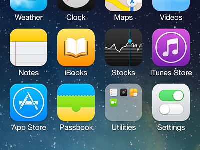
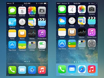
We shall see how the icons/home screen design progress in this new design era at Apple. Check out the attachments for a comparison between my design/iOS 7's and an iPhone 5 screenshot.


