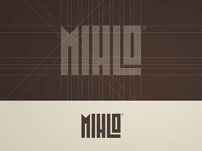
Mihlo - Wordmark Grid Design


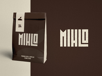
Around a year ago, we partnered up with the Mihlo team in order to develop their Brand Identity & Packaging.
They produce organic tacos & tortillas, and they gave us the task of creating an identity system that appeals to consumers looking for an organic product. The challenge was to do that while standing out from all the other organic products out there in the market. For that reason, we used earthy colors along with a logotype that emphasizes the organic feel.
Press 🤎 if you like the golden ratio!
--
📨 Got a project? Let's work together! Email: wisecrafted@gmail.com
--