SQUARED Logo

Over a period of four weeks (on evenings and weekends) I created a conceptual re-brand of Google's 'Squared' educational initiative.
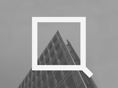
Framing features prominently in the SQUARED brand identity, adding depth and helping to drive focus towards key emotional elements of the images. The logo itself is a frame, both literally and metaphorically.
Here, it frames the peak of one of the buildings within the Central Saint Giles complex, the collection of buildings that contain Google’s primary advertising and sales office in the heart of West Central London.
There's more to come. View the full project here.


