Newav

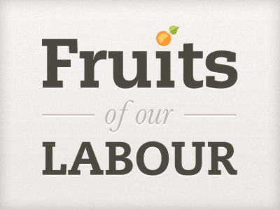
Fruits of our Labour

Fruits

13 Responses

  1. Pro Desk Trent Walton

    Excellent.

    about 2 years ago

  2. Pro Sombrero Chandler Van De Water

    B.e.a.utiful.

    about 2 years ago

  3. Pro 4999915986_6bcf0272d4_b Cole Henley

    Lovely stuff Paul.
    if I was going to nit pick I would tighten up the kerning on the 'i' in 'fruits' and the 'o' in 'labour' but not to distract from a lovely fruity dribbble (oo-er)

    about 2 years ago

  4. Cropped-hell-yeah Mark Otto

    Looks great, though after reading Cole's reply, that's all I see :).

    about 2 years ago

  5. Pro Avatar 2011 Paul Lloyd

    Lovely stuff Paul… but you seem to have missed a link to a recent blog entry ;-)

    about 2 years ago

  6. Pro Gedy Gedy Rivera

    This is beautiful! Great work.

    about 2 years ago

  7. Pro Bob_head2 Bob Galmarini

    Love the font

    about 2 years ago

  8. Newav Paul Annett

    Thanks for the positive feedback! I have a rebound on the way that fixes the kerning and adds a little extra.

    about 2 years ago

  9. Pro 4999915986_6bcf0272d4_b Cole Henley

    a pear perhaps?

    about 2 years ago

  10. Twitter_avatar Jen Strickland

    Whereas I think the r & the u are too tight. =\

    about 2 years ago

  11. Profilepict3_150x150 Markus Vad Flaaten

    Lovely. I like the tiny pixel shadows under everything.

    about 2 years ago

  12. Pro Me Anthony Killeen

    Very nice Paul, looking forward to your rebound.

    about 2 years ago

  13. Newav

    Finding an excuse to include a beautiful Baskerville ampersand, as the original image just wasn't enough of a design cliché already ;-)

    about 2 years ago

keyboard shortcuts: previous shot next shot L or F like