Find designers
Designer search
Quickly find your next designer
Post a job
The #1 job board for design talent
Inspiration
Courses
UX Diploma
Learn UX design from scratch in 6 months
UI Certificate
12-week UI skill building for designers
Live interactive workshops
with design professionals
Jobs
Go Pro
Log in
Dribbble: the community for graphic design
Advance your career with a Professional Diploma in UX Design
Learn more
Log in
Sign up
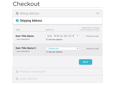
Tabbed Ecommerce Check Out System
Jacob Cass
Available for work
Follow
Following
Like
Get in touch
#F5F5F6
#ABCDD6
#A6A6A9
#33B6D3
#5E5E5F
#313233
#68C5DA
Download color palette
Downsized tabbed e-commerce checkout system I'm working on with Rich Davy at AI.
checkout
ecommerce
shipping
ui
ux
website
View all tags
Posted on Feb 15, 2011
10,126
36
100
5
View feedback
Jacob Cass
🦩Strategy & Design for Brands that Dare to Flair. F'yeah!🦩
Get in touch
More by Jacob Cass
View profile
Previous
Next
Loading…
Loading…
Loading…