


Foehn & Hirsch Logotype Feedback

This is for an important identity project for online electrical and computer seller http://ebuyer.com
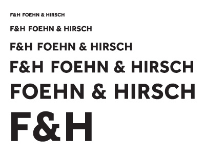
Foehn and Hirsch is their own brand and have asked me to redesign their current logo. We have looked at many styles and have settled on this as the basis for the design.
Given that this is a large roll out, will be printed on a huge array of products, TV's, MP3's, DVD's etc, I need to be sure that the letter spacing etc is top notch.
Not looking for feedback on the actual font as the client is very happy with this design. It consists of a modified font for the ampersand and typeface from Daltoon Maag - Effra Bold.
Any feedback on kerning, general spacing would be most appreciative. The initials will be used mostly for product badges the products, whereas the full wording will be used for websites and product packaging.
After this check, I will be designing a A2 sheet of the logotype at various sizes, colours, tints and backgrounds and getting a Cromalin Proof done for accurate testing.
Thanks in advance.


