Appointedd Logo 2

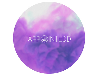
On revision I feel this works much better. Using the crown logo as the O in Appointedd works quiet well I think. I also put a blur on the background to which makes the image less busy looking and draws your eye to the text a bit more. What do you recon guys?


