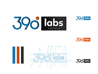
390labs Logo design
I remember joining 390Labs early this year and my first task was in creating a revamp of its company logo. I immediately went into full Sage mode and created different grid structures as well as experimented with different ideologies. I figured it would be best to represent their logo with a wordmark and decided to embrace the culture and ideology behind the degree - 390.
Hence rotating the orange accent on the crown of the Number 0 to an angle of 30 degrees created a whole value of 360 + 30.
I enjoyed working on this project and just thought to share.
Thoughts, critique, and comments are much welcome :)
app
brand design
branding
degrees
design
grid
illustration
logo
logodesign
logo design
logos
number
number logo
software company
software design
technology
technology logo
typography
ui
wordmark logo
View all tags
Posted on
May 21, 2020
More by Mayowa Ogundeji View profile
Like


