


Logo re-design for hotel chain

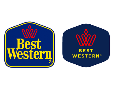
Just for fun. I was doing something at work and I noticed the logo for Best Western had a really nice W that got lost in the big bold yellow type.
I kept the top half of the original shape, made the blue a little deeper to contrast better with the bright red, and made the type smaller with more space between letters. I tried different serif typefaces but they kept competing with the W.
Also, got rid of that giant 'registered trademark' symbol.


