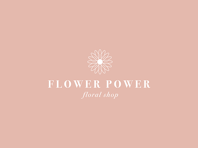
Flower Power

1 Hour Logo Challenge #13 Flower Power
I knew I had to put "flower" and "power" together in the visual upon knowing the brand name 🌸💪
Exploring symbols like thunder to represent "power," I eventually went for the sun. Did you spot it? 🌞
Tried going for an elegant look for this one too, hence the minimal look, serif font, and thin strokes. Yet that’s where I missed – Hitesh reminded me that the icon isn’t very scalable. It was the first thing that he noticed, that the icon doesn’t look pleasant in the eye when seen from afar or scaled to a smaller size.
Other than that, my choice of typeface and colour won him over although we agreed that there could be more contrast. He also had the idea of adopting a more gender-neutral colour for the logo, considering customers could also be male. Thought it was a good point 🤔